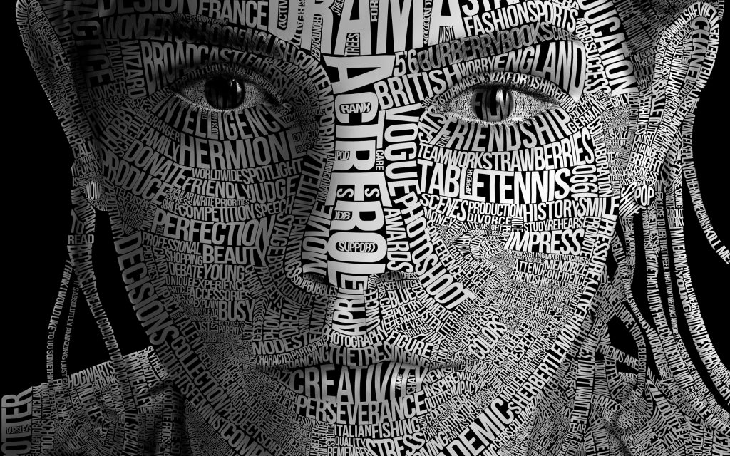
Tech Giants Set to Change the World of Typography

What happens when four of the biggest tech companies in the world join forces to work on a project? Web designers across the globe undoubtedly cheer, as their job is about to become far less stressful. Apple, Google, Microsoft, and Adobe have all teamed up to create what’s known as variable fonts, which basically means that a font can adapt to any device or screen size. Desktops, laptops, tablets, and smartphones will also display the same internet article perfectly, as the variable fonts will adapt fluidly in real-time. The notion has been around for some time, yet with the four tech giants putting their collective weight behind the project it’s only now that it’s come to fruition.
Google in particular has already been instrumental in creating responsive fonts that look good and are easy to integrate, but they and their tech friends are no doubt fully aware of what they’ve given web designers. This is because a variable font can essentially contain an entire font package within a single file (e.g. Arial, Arial Black, Arial Narrow, Arial Unicode MS), which simply gives more scope to how a designer can use his or her skill. Furthermore, it’s said that a variable font file will be up to 70 percent smaller than a conventional font file – a great way to use less bandwidth and speed up the loading time of a website.
Tim Brown, head of typography for Adobe Type, summarized what exactly variable fonts are about and how they will help web designers. “A variable font is a single font that works like multiple fonts,” he said on Fastcodesign.com. “They’ll lead to faster, better websites; smaller app sizes; more flexible typography; and richer typographical palettes.”
And the good news for typography doesn’t end there. Google has also been working on a font project called Noto. Teaming up with font experts Monotype, project Noto has been worked on for close to five years, but has only now seen the light of day. Noto stands for ‘no more tofu,’ and not the food, but those little square boxes you might see in a text, which means a device doesn’t carry that particular character. The massive assortment of fonts are available in approximately 800 languages and 100 writing scripts, which again, can only benefit web designers who need not worry that their works can’t be seen on particular platforms or devices.
“Google Noto is a daunting project in size and scope, and I’m proud of how we’ve worked hard over the past five years to develop a really good product that solves a problem no one else has taken on before,” said Bob Jung on Techcrunch.com, director of internationalization at Google.
Designers can find inspiration in many places, but these latest developments in the industry only serve to give more help, and fewer design headaches.


 One-Handed Plate Set by Sahar Madanat Haddad
 Coca-Cola Tet 2014 by Rice Creative
 Le Maestro by Herman Francisco Delos Santos

